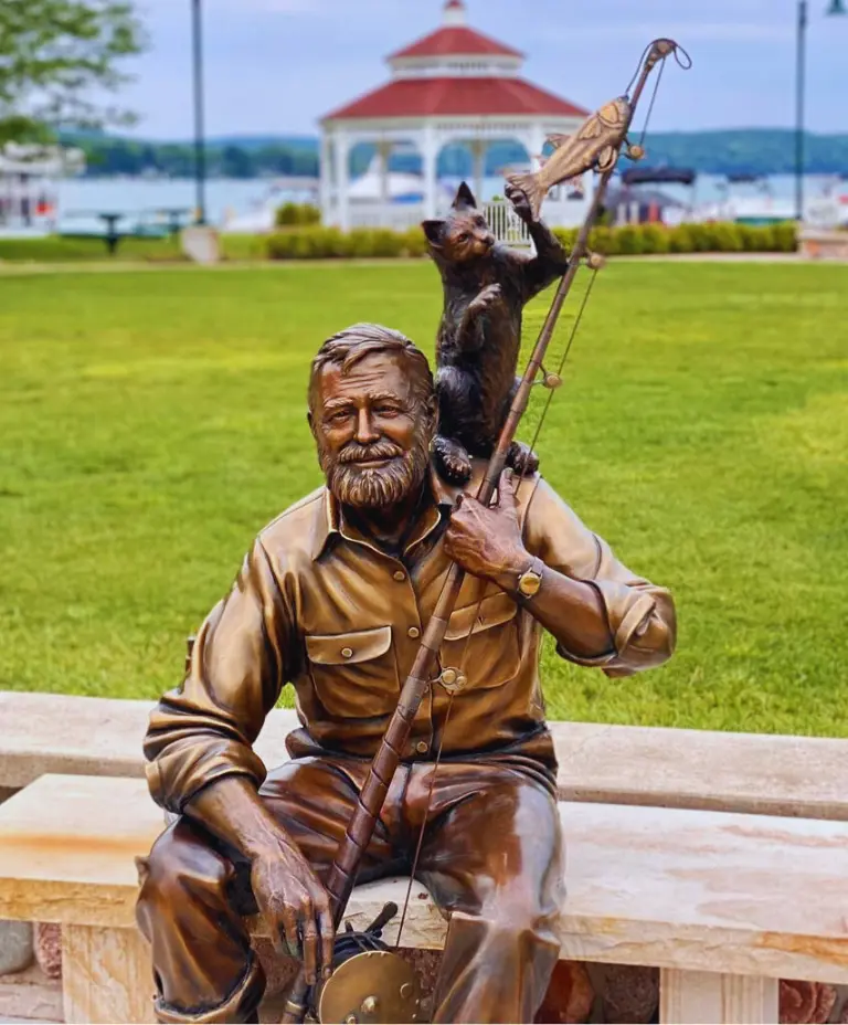
 "The Old Man and The Cat"Sculpture by George Lundeen
“I wanted to create something people might want to sit next to and maybe talk to. In my sculpture, Hemingway has his book by his side, his bottle of whiskey, a six-toed cat on his shoulder, and his favorite fishing rod in hand. What else could a guy want?”
Extended Interview with George Lundeen: I decided to depict Hemingway in his 50s. That was when he had a full beard and still look fairly handsome. That’s when he would have been writing The Old Man and the Sea. I wanted to capture him in a relaxed mood, about to go out fishing.
Walloon Lake would become a favorite place for Hemingway, who visited every summer until his 1921 wedding to Hadley Richardson in nearby Horton Bay. The newlyweds spent their honeymoon at Windemere before returning to Chicago and ultimately relocating to Paris in December of that year. He would never return to his beloved Walloon Lake – saying it was so perfect in his memory that he never wanted to taint or change that image. And while he (like Knox and Lundeen) traveled the world experiencing a multitude of cultural experiences, he always held Walloon Lake close to his heart.
From the plaque next to sculpture: Drawing inspiration from The Old Man and the Sea – one of Hemingway’s most noted works and the one for which he received both the Pulitzer and Nobel Prize (in 1953 and 1954, respectively) – George Lundeen dug deep into the author’s past including his love of fishing, drinking and polydactyl (six-toed) cats which are all depicted in the sculpture…
This bronze sculpture sits very near the place where Ernest was first introduced to this picturesque community (and lake) in the fall of 1899. He was just three months old that year when he came with his parents
Artist
Location
 What do you See?
 "Monolith"Song by Pete Kehoe
“The sculpture [Stop 1] relayed a sense of calm, peace, and a simple order of things. I felt a deep reverence for generational wisdom begging to be passed on. From the balance and symmetry of the sculpture, I took away a feeling of “again” & “re-birth,” and that there is an order to things in the universe we may not recognize or understand that is beautiful and calm.”
Extended Interview with Pete Kehoe: “This project felt like a treasure hunt. I was given coordinates, not an address, to the art I was to interpret. My directions were to interpret the essence of the sculpture and write a piece of music representing my interpretation. I drove out to the site to find a sculpture I’d never seen before, though I’m at those coordinates at least once a week. Despite my deep familiarity with the location, I had never noticed the sculpture.
My takeaways from my visit with the sculpture were that there is ancient wisdom that wants to be imparted to the next generation from our ancestors. There is a long Native American (indigenous) tradition in the Ojibwa Tribe of passing along ancient wisdom from one generation to the next from the elders. The oral and ceremonial lessons are referred to as “The Seven Grandfather Teachings,” and they offer the next generation scaffolding to understand how to live a good life, one with respect for all living things, because we are all connected.
I was left with a sense of how important it is to pass along wisdom and knowledge. It is a tradition we’ve largely forgotten in our culture, and in the sculpture, I felt ancient wisdom begging to be passed along.
I used the theme of seven from what I know about The Seven Grandfather Teachings to pass along the wisdom of the ancestors about how to be a good person. From the seven elements used in that tradition, I came up with the opening melody while standing in front of the sculpture. It has seven notes, and I used that 7-note melody as a guideline that developed on its own. I wanted to keep the song very simple and minimalistic, because the sculpture itself is minimalistic. I wanted to call my song “Grandfather,” but in the end, I called it “Monolith.” I didn’t want to be insensitive to a culture I’m not a direct descendant of.
I tried to imagine myself standing in front of the sculpture for the first time and hearing the music alongside it. I didn’t want to interfere; I wanted the music to complement the sculpture, to make it sound like it was a part of the environment. My song describes the sculpture visually but also alludes to there being one truth or one way to live that wants to be passed along from generation to generation, and that’s what the grandfather was trying to get across through the generations. It’s ironic, right? Here is this piece, calling out to be seen for the knowledge it has to impart, and I’d walked by it for years and never seen it. But that is what we as humans do, isn’t it? Forgo the previous generation’s wisdom, believing our own thinking superior.
I just wonder how many people, like me, walk past the sculpture every day, and how many have sat down next to it and really taken notice. I’m curious to see what happens with the next artist in line. I hope they can hear the simplicity, order, and minimalist nature of the sculpture in my song.
Artist
Location
What do you Hear?
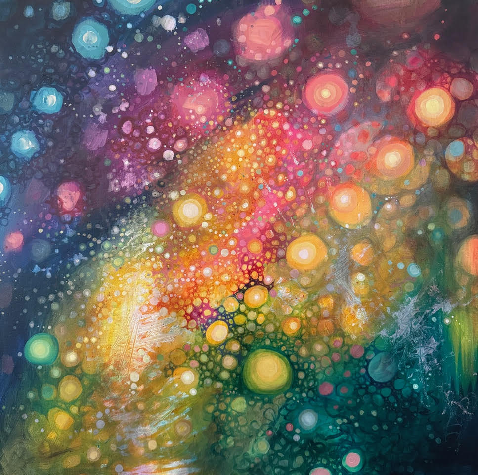
 "I Am"Painting by Mary Bea McWatters
“The music felt peaceful and calming. It made me think of outer space and starlight. Some sounds made me feel sparkly or bubbly. It moved a subtle, untouchable inner space in me, which is interesting because what I depicted in my painting was a deep, untouchable outer space. Hmm, maybe they’re the same thing.”
Extended Interview with Mary Bea McWatters: The music [Stop 2] felt ethereal, gentle, but powerful. There was a lot of simple repetition, and immediately, a visual came to me. I could hear different layers of sound translate into gradients of color, representing the different sizes and distances between orbs I would later create. For example, a higher or louder sound equated to a larger orb, and a smaller orb might represent a distant or quieter sound. The music made me think of outer space and starlight. Some sounds made me feel sparkly or bubbly. Then there was a voice that came in. It sounded like it started small and grew. There were ascending sounds and receding sounds.
The song was very peaceful and calming. It touched a deep emotional space in me, one that’s not readily available. It moved something subtle, an inner, untouchable space in me, which is interesting because what I depicted in my painting was a deep, untouchable outer space. Hmm, maybe they’re the same thing.
Artist
Location
What do you See?
 “Before 4:15”Animation by Anne Morningstar
“I felt like I was looking down into the painting as you might look at fish in the ocean. In it, I saw a universe inside the mind, a lifetime of memories, good, bad, and ugly. I saw birth, rebirth, life cycles that branch off parents’ stories, and memories that burst into being, live inside, and die off. The painting contained the wisdom and peace that comes from knowing life is beautiful, even the painful bits.”
Extended Interview with Anne Morningstar: The painting [Stop 3] felt hopeful. There was a sage wisdom and interconnectedness in it. Each of the bubbles was a memory. I wanted to zoom into each bubble, into each memory, and dive deep inside the painting. I was looking at a lifetime’s worth of memories, the good, the bad, and the ugly of life’s experiences. There was all this emotion in the painting, and with it, the wisdom and peace that comes from knowing life is beautiful, even the painful bits.
I came to see that each bubble, or orb, in the painting is a different moment in time. Though each is unique and individual, they’re all interrelated, and I suddenly realized that the painting, for me, was about my kids and the creation of their core memories.
“Before” is the name of a song by Hammock. It represented the essence of the painting, and I used it as a backdrop for my animation. My kids were born to the song, so it seemed fitting. Intervals of 4 and 15 kept showing up in my research about memory.
My husband’s grandfather died of Parkinson’s and was a self-taught artist. We have his work around our house, and we named our son Griffin after him. Griffin got to meet and talk with his grandfather, who imparted memories and stories, and the idea that though his memories faded as his disease progressed, he was able to pass along his wisdom, and his memories live on inside my son in a new, unique iteration.
The beginning of my animation represents birth, the birth of my three children. It’s sort of scary and ominous, but soon, memories start to pop up. When children are born, they’re sort of predisposed to inheriting their parents’ narrative, but soon they start spinning and branching off to have their own memories.
Our inner world is being held in place much the way the universe holds onto galaxies, the stars, black holes, planets, and everything else.
Song credit: “Before” by Hammock
Artist
Location
What do you See?
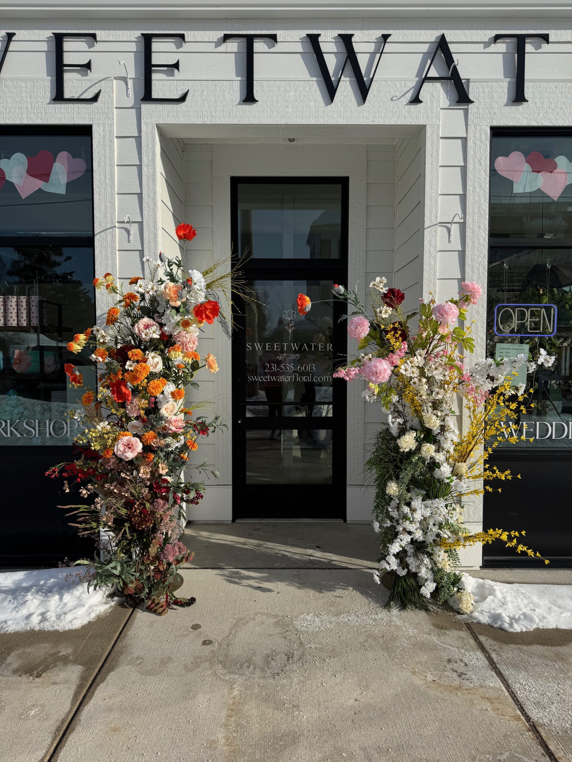
 “The Season You're In”Floral Installation by Kalin Sheick of Sweetwater Floral
“For me, the animation was about motherhood and transformation. I started to reflect on the seasons of self-identity we each go through in life… how we’re born and reborn as we take on new roles and shed things that don’t serve us. The trick is to find beauty in the chaos and love rather than just letting the inevitability of unmanageability be the end result. And that’s the art of both motherhood and tending flowers.”
Extended Interview with Kalin Sheick: The first thing that came to me as I watched the animation [Stop 4] was motherhood and transformation, and I said to myself, Oh, this is about the journey of becoming a parent.
I saw the protagonist in the animation, time and again, shedding an old version of self and trying on new roles. When I made my piece, I leaned into the idea that each of us moves through the seasons without focusing on one past. We just have faith that the next one will come.
Another thing I noticed in the animation is that the very background layer is a map of our area, so I decided to have all the flowers in the piece feel like stuff we see growing here all the time.
The ethereal, spacey moments in the animation were like a continuum, the cycle of life and the seasons; winter will always come back again like spring, like summer, like fall. A circle has no beginning or end, and so in my piece, I wanted create the feeling of ‘again,’ like the circle of the seasons.
In the video, I felt like the main character didn’t have to know where they were going; they just dove in with reckless abandon again and again and found their way. I related this to being an artist and being a mother because being lost and having faith we’ll find our way is what we do every day.
In both roles, you birth something you want to make beautiful and help grow while knowing you have little control. The magic of being a mother or an artist is being curious enough to start something you don’t know all the answers to. You have to be willing to make mistakes and follow your gut, knowing the result will be exactly what it was always meant to be. Being a mother is an unfurling of yourself every day. What makes it so beautiful is that you can’t control so much of it. That’s what tending flowers is like. You cannot keep kids or flowers in any one stage for too long. You cannot force them to do things that they won’t. You cannot control them.
I had a vision of what I wanted to create to represent the animation in flowers: a theme of motherhood and eternal spring. But just when I was stepping out the door to go to the store, my childcare situation fell apart. So, I had my two girls with me when I went to source materials for my piece. By the time we got to the shop, both girls were full meltdown, body flopping, screaming and crying on the floor. I was momming to the extreme, and my kids were in total hysterics. And I just laughed because my piece was meant to be about themes of eternal spring and motherhood, and I’m like, this is so hard right now, but it felt like it was meant to be. Kismet.
Being an artist, or mother, is the art of deep love working optimistically in a powerless state, with unruly material that, like flowers, or like children that have an agenda all their own. Learning how to release where you can, go with it, and lean into it where it’s working is the artist’s way. One thing that I teach anyone learning floral design with me is that if you’re trying to hard to control the outcome, you will miss so much of the joy along the way.
As with the animation, as with mothering, as with flowers, you have a beginning/birth, middle/bloom, and end/death. You’ve got to lean into the joy of each stage, work with what you’ve got, and learn to pivot. Hopefully, when people see my design, it inspires them to reflect on all the seasons of their lives.
Artist
Location
What do you See?
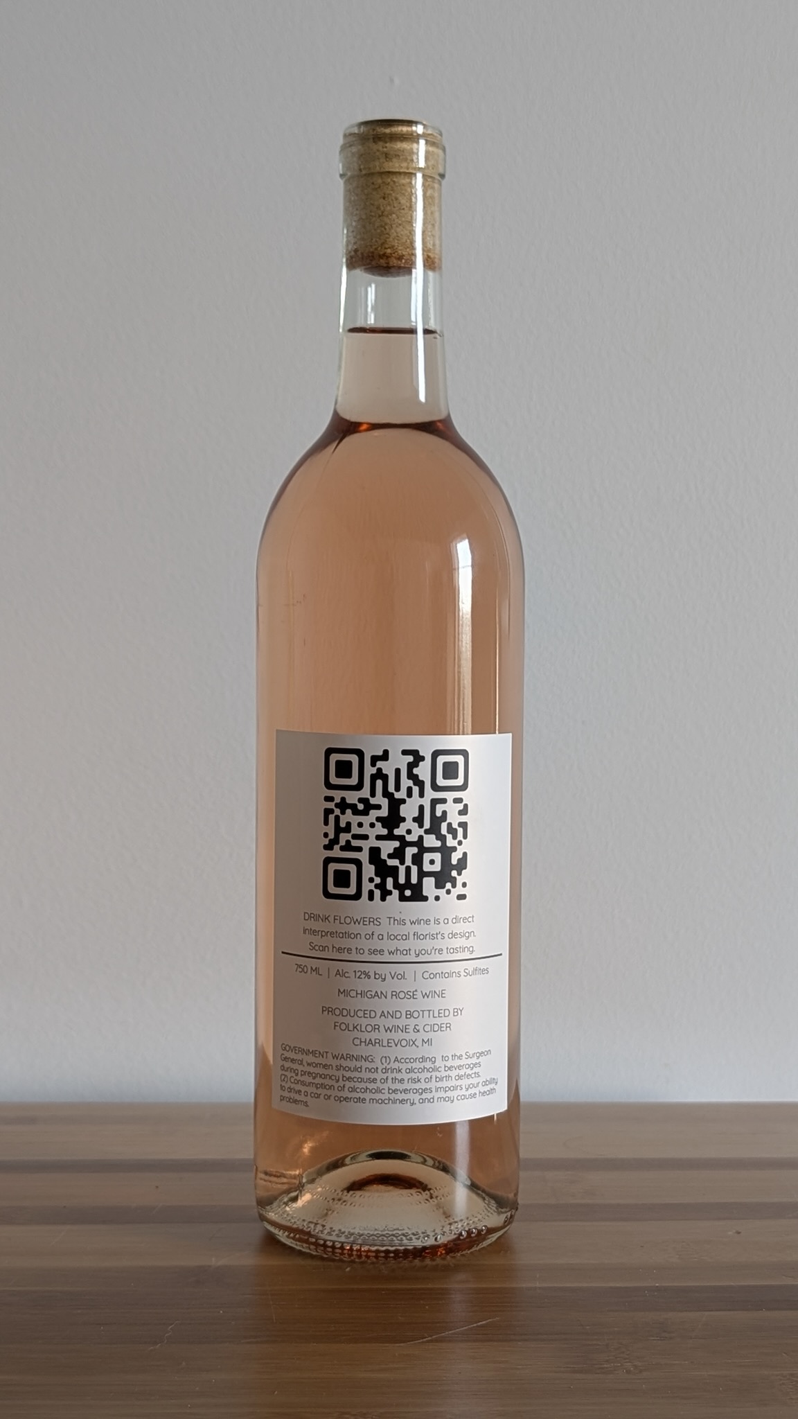
 "Drink Flowers"A Wine by Folklore
“The colors in the floral installation we interpreted were arranged from dark to light. It gave us the sense of seasons transitioning from winter to spring. Rebirth. We gravitated to the orangish, blushy, golden-salmon color that seemed to represent the aura of the entire piece. We ended up with a super floral aromatic bubbly rose with a touch of red fruit, and what to us tastes almost like peach pit.”
Extended Interview with Isabela Babinska & and Derrick Vogel: We always strive for the right color and aromatics in our products in general, so we nerd out on flowers and things growing in the vineyards in the orchards all the time.
Izabela: I saw a lot of spring in the arrangement we interpreted [Stop 5]. But it was also representative of the transitional period. The colors were arranged from dark to light, which gave the sense of the seasons transitioning from winter to spring. Rebirth. When spring comes to Michigan, we start to see things growing in our area again. It’s the best feeling in the world and that’s what the floral design represented to me: relief after a long winter, waiting for life to restart, an awakening.
Derrick: It was a long winter up here, and we were surrounded by a two-tone landscape of brown and white for most of it so it was a breath of fresh air to see this beautiful pop of color on display, and I gravitated to one color specifically. It was an orangish blushy golden-salmon color that seemed to represent the aura of the entire piece for me. I was also drawn to some of the flowers I thought I recognized as being native or local. I wanted to represent them in the wine a sort of savory or herbal way.
We saw forsythia, and thistle, things that grow in abundance in the wild even on the roadsides and then there were things like peony and dahlia, flowers that might take a little bit more nurturing. We wanted to represent that in our wine. The Riesling grape is the most widely planted grape in Michigan. It’s fairly ubiquitous. You kind of see it all over the place. And then the other grape we worked with is not nearly as common. There’s a lot less of it. So I thought there was a nice parallel in that.
Having a floral component in the aromatics was important for us, that and getting that perfect golden salmony color. Consenses tested our intuition because some of the blends we made just did not work, they didn’t represent how we interpreted the floral arrangement and when we tasted it was very much an automatic “Nope,” “That color is wrong,” or “The nose is wrong,” “The palette isn’t connecting in a way that represents the essence of the floral arrangement.” We also wanted to present it in a clear glass container. It had to pop, and we wanted it to reveal itself in the bottle.
What we ended up with is a super floral aromatic rose with a touch of red fruit, and what to us tastes almost like peach pit.
Artist
Location
What do you Taste?
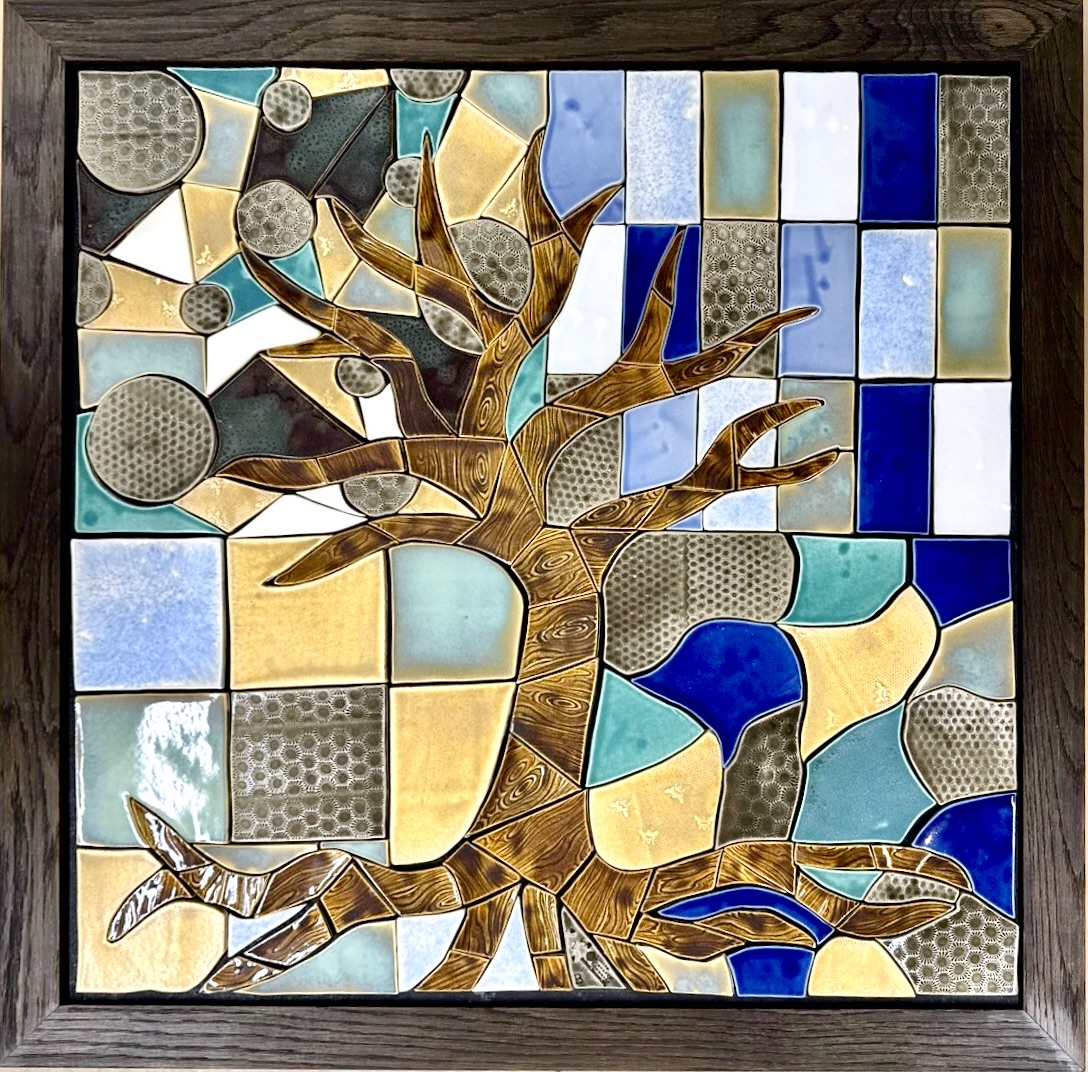
 “Tree of Life”Mosaic by Little Traverse Tileworks
“We dove into the idea of springtime and rebirth and decided to do a version of the tree of life before it’s grown all its leaves. The circles represent the bubbles in the wine we interpreted [Stop 6]. The straight lines represented structure, and the curvy lines represented nature. We wanted to capture a sense of anticipation and rebirth. Up here in Walloon, we get to see trees in all stages of the life cycle and how different they appear through all the seasons.”
Extended Interview with Cora Waite of Little Traverse Tileworks: Our team of four sat down with the bottle of wine we were to interpret. It had no label. It was just pure, and beautiful glass. No one gets something like that where it’s just glass and no sticker, and your only focus is what’s in the bottle. It was special. We started sipping (not something we normally do on the job). Each of us wrote our own list of descriptors as they came to mind. Words that reoccurred between our lists were: green olives, bright, easter floral, nest, barnwood, Harbor Springs, water, bubbles, spring, rebirth, and pear. After sharing our word lists, we each came up with our own separate designs and decided to incorporate all four of them into our final piece. We wanted to represent words on our lists that overlapped. There were certain colors we wanted to use: green and opal. We wish we had a color we could have used to represent the actual color of the wine because it was so beautiful.
I kind of ran with the bubbles idea and connected them into the 4 different quadrants. We dove into the idea of springtime and rebirth and decided to do a version of a tree of life before it has grown all its leaves. We wanted to capture a sense of anticipation and rebirth. There was almost a sour taste to the wine, which we interpreted as straight, structural lines, and the curvy, soft lines represent nature, because you don’t see too many straight lines in nature. The circles represent the bursting bubbles in the wine. The circular shape with the dot in the right bottom quadrant is homage to the green olive we somehow mysteriously all came up with on our word lists. The tree of life represents rebirth and being close to nature. Up here in Walloon, we get to see the trees in all stages of the life cycle and how different they appear through each of the seasons.
Artist
Location
What do you See?
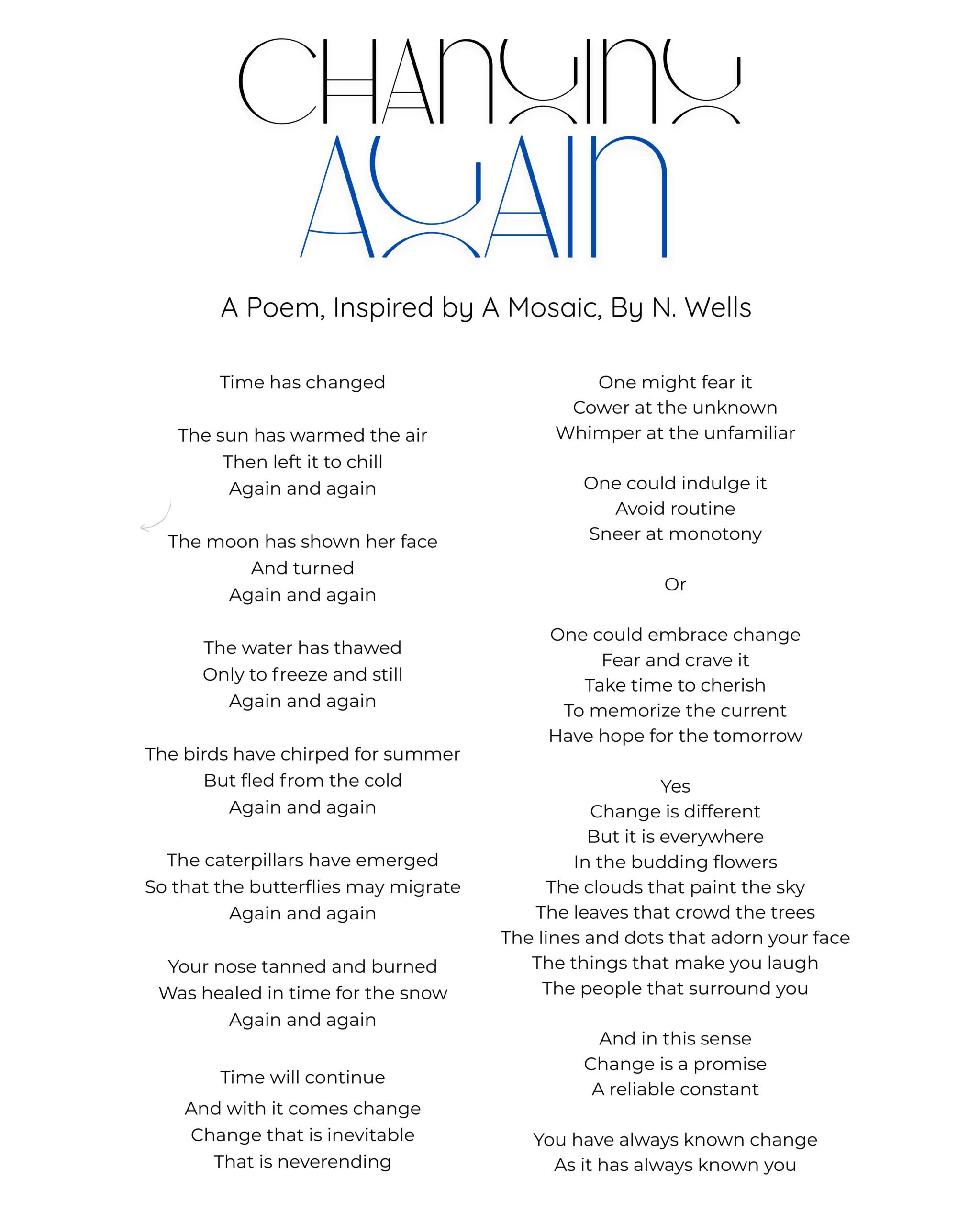
 “Changing Again”A poem by N. Wells
“The tree looked just like one in my grandparents’ yard. Their home and that tree were stabilizing forces for me in a chaotic childhood… Recently, the tree died, and my grandfather took it down. My poem was a farewell to the tree. Ultimately, I hope people read it and find comfort and beauty in change, in the changes that happen both externally and internally.”
Extended Interview with N. Wells: The tree in the mosaic looked just like the one in my grandparents’ yard. I grew up in their house, and their home was a stabilizing force in a chaotic childhood. The tree in their yard always felt like an old friend, like a house cat or family pet, something that was there before you were born, something that’s seen you through your life, and something that (you imagine) will always be. But a week before I got the mosaic to interpret, I went back to my grandparents’ home, and they told me the tree was dead and would need to come down. I had no idea it would be so soon until the next day, when my grandfather woke up before dawn and took it down. It was gone before I even opened my eyes. The poem was almost a farewell to the tree. It was my mourning and reckoning with change (something I hate).
I love nature so when I got the mosaic, it calmed me. Besides being so taken by the tree, I was struck by the Petosky stones, which stuck out at me because they were so distinctively shaped. I started thinking about children’s bubbles blowing in the wind.
After I got the mosaic, I sat down in the woods in the grass and felt the sun on my face. When you’re in nature, everything drifts off and drops away except that which is immediately present. I was brought back to my childhood, to the feeling that “Everything is going to be OK.” That is the sensation I wanted to convey in my poem: sun on skin, childhood, the recognition that change can be scary and unfamiliar but beautiful in that, even change (because it comes again and again in cycles) is a familiar friend.
In my poem, I started with big physical things that change: the sun, moon, and water. Then I got smaller and smaller: birds & caterpillars, until the poem references “you.” This “you” is all of us, the reader, you, me, the person standing next to you. The first half of the poem challenges “you,” the reader, to acknowledge the external cycles of change that happen all around us. The second half of my poem turns inward, into the abstract, into the internal changes that happen emotionally inside us in reaction to change.
Ultimately, I hope people read my poem and find comfort and beauty in change, in the changes that happen both externally and internally. I hope they come away realizing, “Everything is going to be OK.”
Artist
Location
What do you See?